

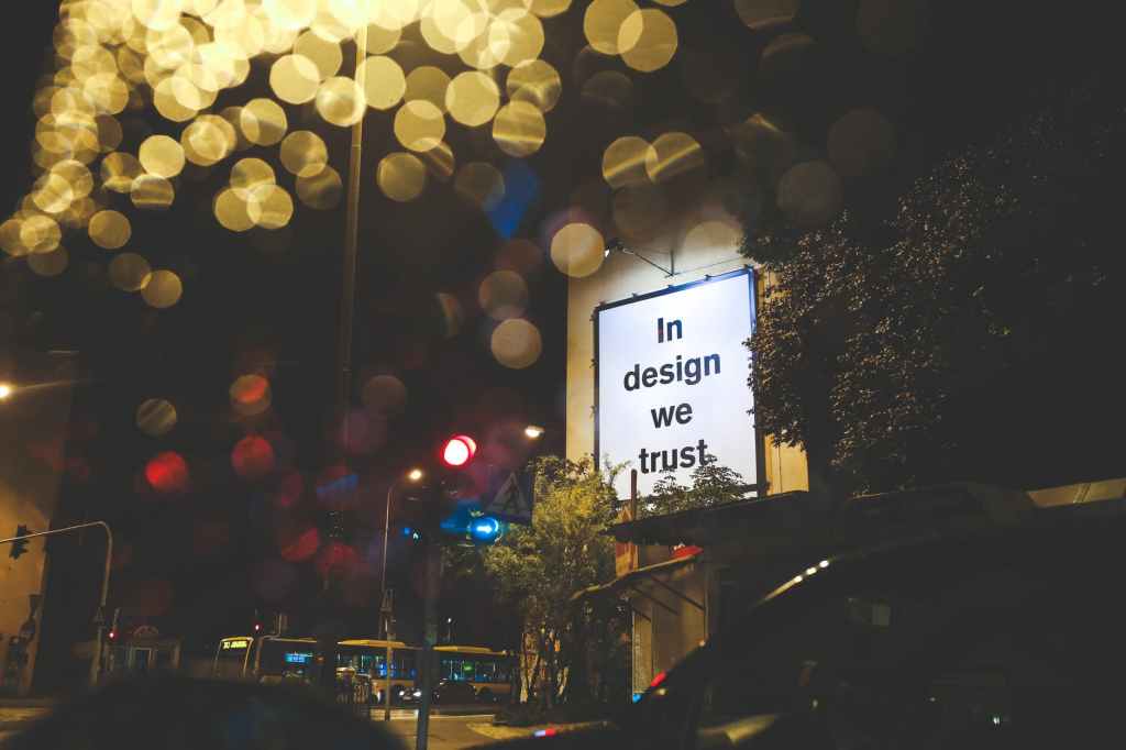
In previous posts on how many slides and how many words I’ve noted that slides should look like billboards.
This begs the question of why do billboards look like billboards?

Effective billboards are designed completely in mind of what circumstances people are in when they are looking at billboards. They are not designed with any old elements that fit in a rectangle of that size.
Billboards use audiences first design.
Roadside billboards have a primary audience of people in cars. If the car in question has only one occupant, that person is the driver. (Until robots become more common.)
Drivers have limited attention spans because they are driving. Their eyes are constantly flitting around. I remember in driver’s ed being taught to never look in the same place for too long. Ahead. Speedometer. Ahead. Rear-view mirror. Ahead. Dashboard. Ahead. Side mirror. Ahead. If you’ve been driving for some number of years, you do this almost unconsciously. You are focused on the task at hand.
So a billboard has to communicate in a way that is quickly digested by someone who is not lingering in their gaze. One second or a fraction of a second: Really large words. Gigantic pictures. High contrast colors. Design layout that makes it easy to figure out where you were in a previous quick look.
Even when billboards use humor their message is quickly understood.
Need food? Eat with us this distance ahead.
Need a lawyer? Call this number.
Selling a home? This company is it.
Simple.
Why so simple? Because a cluttered design hides the message from the primary audience – drivers. Large words jump out, visually screaming to be looked at. For drivers, the most effective billboards are the ones readable at a long distance: when the billboard is along the central line of vision, down the road.
By the time the car gets close enough for the driver to see smaller fonts, the car is almost alongside the billboard. Anything that is within striking distance of a car will only be noticed by the driver if it is on the road: Fancy buildings and elaborate gardens and billboards next the road are not noticed by drivers in any level of detail, if at all.
Intricate design elements, if they can even be seen at a distance, are only useful to people in the car who are not driving. From a marketing cost standpoint, that’s throwing money away: Designing your billboard in a way that does not register with drivers means you are giving up on the majority audience, especially along heavy-traffic corridors. You may as well be playing video on the radio if your billboard is tricky to read.
Billboards are expensive, so they need to be simply understood for the best return on investment.
But why then should slides look like billboards? They are not expensive to include – software makes it easy to include as many slides as you can create. And audiences aren’t driving a car when they’re listening to your talk. At least I sure hope not.
No, audiences are confronted with a lot more things calling for their attention when you’re giving a talk. Since audiences’ minds are not focused on keeping a car on the road, their minds are happily open to distraction.
Think of all the things an audience member could have calling their attention when they’re sitting in a talk: the speaker, the slides, the furniture and decor of the room, other people in the audience, their own shoes, the floor design, things on their lap – their phone, their notes, things in their bag – the ceiling, the lighting, people coming into the room making a noise at the door, people getting a seat in front of them, people getting up to leave, whispers behind them, someone’s phone making a noise, their own phone showing an alert.
There are plenty of auditory and visual distractions for the audience in the middle of a talk, to say nothing of the distractions of thought going on inside their heads.
You as a speaker are using auditory and visual elements to convey information to your audience, so you need to make both as compelling as possible to connect with your audience.
This is why slides need to look like billboards – simple visuals that jump out for attention. They can be looked at very quickly and then attention turned back to the speaker.
Your presentation in a sense is the road ahead for the audience – you are sharing with them an idea or information you think will help them in their future selves. Perhaps immediately, perhaps down the road.
But that’s just it – down the road. Good presentations provide a destination for audiences to consider. Through the talk you are helping them navigate a path you know well. Keep the audience’s attention to where you are taking them by providing visuals that contribute information but do not distract attention.
So if your ideas are the destination, and your audience are the drivers choosing to go there, does it not make perfect sense that your slides should look like billboards?
Put audiences first so your ideas are remembered in the end.

[ I am not a psychologist, so I am perhaps using the word “psychology” in ways that does not mean exactly what it does to a psychologist. Or a neurologist. In this context, I am using the Oxford English Dictionary’s definition of “psychology” as “the science of the nature, functioning, and development of the human mind … including the faculties of reason, emotion, perception, communication, etc.” [The New Shorter OED, 1993, emphasis mine – yes, I have the hardcopy next to me as I write this. Here’s a internet definition of psychology]. I think this is how many people think of the word “psychology” – that it pertains to how the mind/brain works. I do this in confidence in this blog because I am not writing a blog for psychologists. I am writing a blog for presenters. I am putting my audience first, using words the way I imagine the sorts of readers I’m targeting use words. Always put audiences first.]
[When self-driving cars become more common, watch that billboards will look more like the ones you see in urban environments where the primary viewers are pedestrians. People who can look at signs for much longer. They might have more video, with sound-less vignettes that can be viewed by passengers sailing by. They might have elements that can activate phones – like when QR codes first came out and billboard designers experimented. When the primary audience changes, the design of the sign will change based on how that audience member’s mind can focus on the sign. Put audiences first.]


Leave a comment