


Before we even get to modifying some slides there is one question you need to ask yourself.
Who are these slides for?
That thought, putting audiences first, should be foremost in your mind for any talk. Not “What do I want to say in this talk?” or “How much time do I have?” and certainly not “I’ll just show the same slides I always do and say different things.” The most important pronouns in thinking about a talk are “you the audience” or “they the audience”. Never what “I can say” or “my content.”
Revise your presentation to connect with each audience type; do not use a standard deck with different oral remarks.
Why?
Presentations with slides are a big ask of your audiences’ brains. You are both speaking out loud and showing them images while you speak. You are drawing on two senses at the same time – vision and hearing. Done poorly this can result in a mental train wreck where your audience cannot maintain their attention and therefore not remember what you said.
Each person in an audience has a finite amount of attention to give. That is just human nature, it has nothing to do with how much a given person knows. Perhaps they are tired. Perhaps they just had a jolt of caffeine. Perhaps they are really interested in your talk. Perhaps they’re trying to multitask during a busy conference.
Everything you show and say is an ask of your audience members’ finite attention. So design your slides to maximize their investment in your message. Otherwise you risk saying a lot and showing a lot that no one else carries forward.
Audiences first slide design means showing the audience where to focus their attention so they remember your message.
Think deeply about the sorts of slides that your audience is used to seeing. Also consider how much of the material they will know before you deliver your talk. Thinking of them first results in a better experience for you.
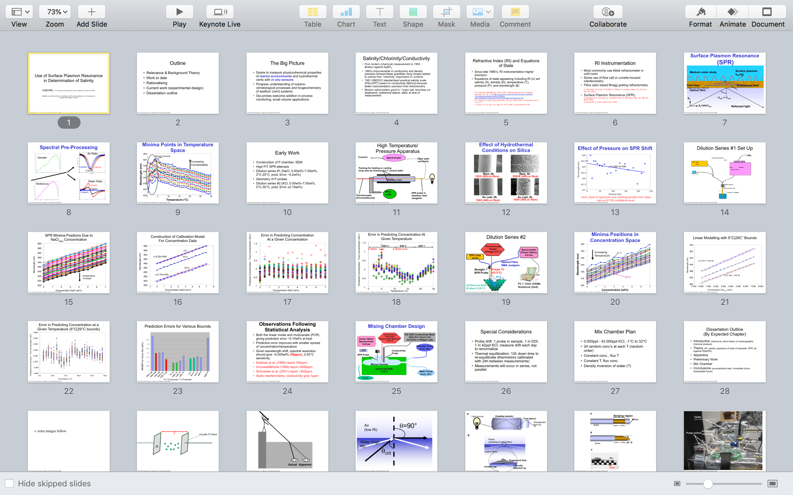
Here is the example I am using in this series: The slides below were written for a very technical audience.
(Here is a link to them in pdf.)
This slide deck has a lot of technical pictures and graphs. Which is reasonable for a technical audience.
For readers who have seen a lot of technical talks, in the sciences or engineering or economics or law or policy or military, this sort of deck looks familiar. Many clients who are used to technical talks say this when I start working with them, that their audience has come to expect this style and so it is on the speaker to deliver it in a memorable way.
Just because a presentation style is common in a given field does not mean it is effective.
When the stakes are high do you want to risk showing a clunky presentation to audience members who are tired or having a bad day? Or do you want to make sure you grab their attention, keep it, and have them remembering what you said?
The context for this slide deck was high stakes for me: Essentially, I was showing an experiment I was about to start. My audience was a small group (5 people) of chemistry professors that in 6-9 months after this talk would decide if I should get a Ph.D. based on my results and analysis. It was my goal to retain their attention to get their advice and set up their memory for when they judged me down the road.
But the way I had set up this slide deck was guaranteed to distract attention early and risk never getting it back. Or, perhaps worse, to frustrate my audience with too much information, presenting with confusing visuals, and risk the Q&A having an edge to it.
Current me would advise old me to completely change this presentation. Which is doable:
It is possible to create a presentation that is informationally dense using slides that are not.
Over the coming installments in this series, I will modify this technical presentation. I hope this will help you see how putting audiences first make you effective in the end.


Leave a comment