


Here’s a really quick tip to start making your presentations look better: this is the first thing I do when looking at a slide deck written by someone else.
Both PowerPoint and Keynote have a handy tool that allows you to quickly assess your whole talk at once. In PowerPoint it is called “Slide Sorter”; in Keynote is is called “Light Table”. Both are accessible through the respective “View” tabs. Here’s how it looks for the technical talk in this blog series:
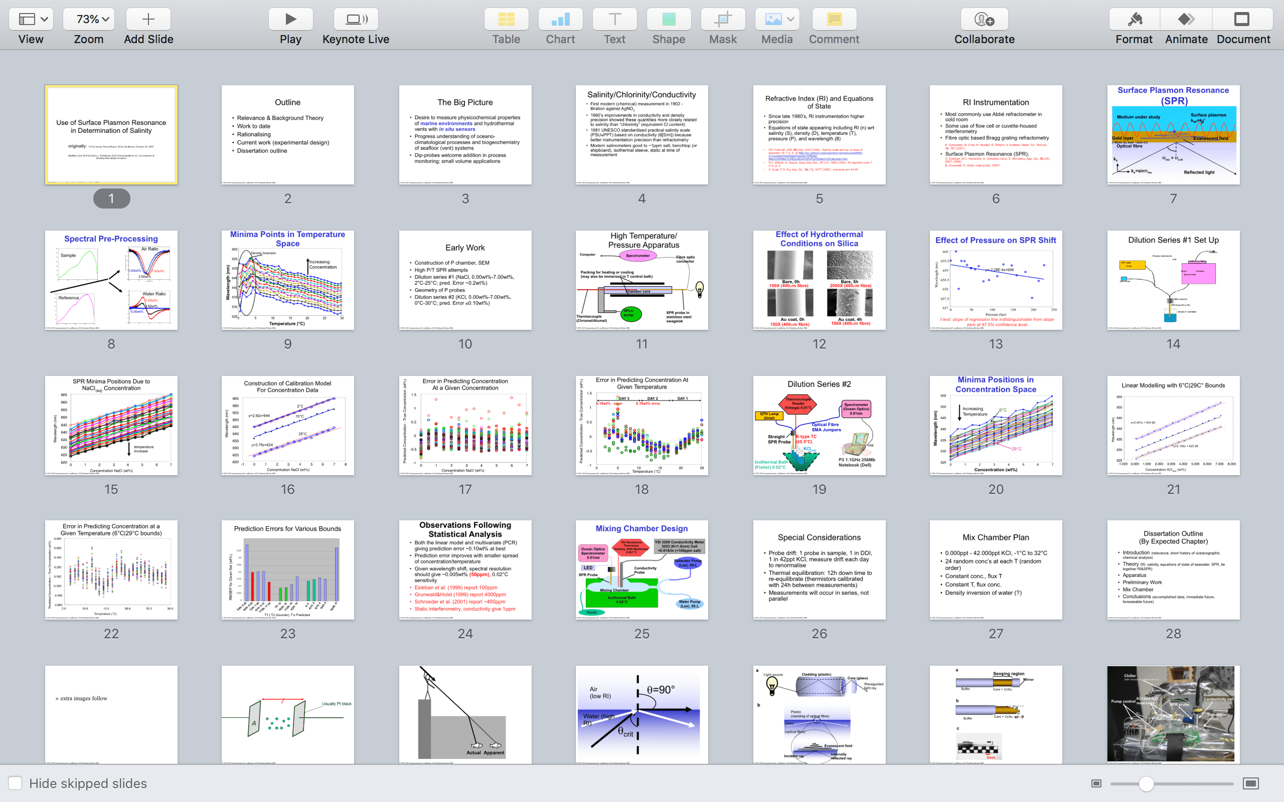
Now count the types of slides as they appear:
6 text (including the title slide)
1 figure
2 graphs
1 text
2 figures
1 graph
1 figure
4 graphs
1 figure
4 graphs
1 text
1 figure
3 text
[then slide 29 shows additional images to be considered]
This presentation is set up for failure right off the top. Six slides of just text in a row will have the audience’s brains numb out as they try to read while listening to the speaker. Repetition of a single slide type causes attention drift, and attention can be really hard to pull back in.
An audience that does not retain attention during a talk will not remember the content of that talk.
The audience is not shown an image until slide 7 and it starts a very important section – the central concept of the method I was presenting. If my audience’s attention had drifted thanks to the walls of text to begin, their minds are not set to take in this information. That might make the audience frustrated through the rest of the talk. Given I know that my talks used to delay the central idea, I probably spent too much time on the opening set – text slows down the presenter too – meaning I raced through the important introduction of the science.
After dulling the audience’s attention off the top, I have a run of 13 graphic slides in a row, many of them very informationally dense graphs. This talk was intended for a technical audience but there is a lot of content there that could be presented in a different way, either with text or pictures. Graph after graph after graph can be worse than text slide after text slide, because each graph that is new to audience has them trying to orient themselves to its layout and probably squinting thanks to the small fonts used. This exhausts the audience’s brains, right after I’ve numbed them.
Not good.
But there is a solution.
Editing, not writing, is the key to making presentations more memorable.
Truly look at what is said on each slide and think deeply as an editor about two questions:
a) does this absolutely need to be on a slide – can I just say it out loud instead?
b) could this be shown another way? If it’s text, could I use a graphic; if it’s a graphic, could I use text?
First, edit out any content you could just easily say … better yet, cut it entirely. Shorter is always better for your audience’s attention.
Then look at the slide frequency. If you have several same-looking slides in a row, change one of them to a very different looking slide.
Here is a revised (but still not final) version of this talk using this principle and a little text editing as well:

Already this deck is 8 slides shorter its frequency is as follows:
1 text (title slide)
1 graphic
2 text
1 figure
2 graphs
1 text
2 figures
2 graphs
1 figure
3 graphs (note graph 3 looks very different from the other graphs in this deck)
1 text
2 figures
2 text (including thank you – always explicitly tell your audience when you are finished)
No one slide type repeats more than 3 times, and even figures and graphs are interspersed. While the talk might be informationally dense, the audience will not numb out from seeing the same sort of slide over and over in sequence.
Note all of the slides are from the original deck except the second slide. That image conveys the intent that the previous text tried to, while taking out extra information and more detail than is needed at the beginning. By taking the time to find an image that captures several slides of text, not only do I break up the slide monotony, but I provide a nice starting point for the audience to quickly come to the central needs of the presentation.
Editing is an essential part of the presentation writing process. It will make or break your audience’s attention and thus your success.
In the next installment, I will show how to consolidate text slides, a little like I did for the revision shown today. While some aspects of that process require mastery of the content, many of them can be done just by applying a strict sense of language editing.
This is a series on showing a little of how I approach a slide deck from a client. Specifically in this case, a technical talk that I gave in 2002 as I was preparing to finish my Ph.D. in analytical chemistry. If you’d like to see the other posts in the series, check out my blog.


Leave a comment