


“Fewer text slides!!!!!”
Although I’m not quoting anyone in particular, this is probably the most common piece of feedback I’ve heard or read when audiences make recommendations on how to improve a slide deck.
Being a believer of putting the useful bits up front, here is what fewer text slides could look like:

So much nicer without bullet points!
Here’s what this looked like before (version 1):
UGH.
It’s okay – scroll back up to the nicer version.
So, how do I suggest that you edit your text-heavy slide decks?
I could have gone back and edited all those text slides, but as I had shown in the previous post, many of the ideas in text could be completely eliminated or shown graphically. For example “The Big Picture” (original slide 3) speaks to marine environments, so I just put in an image of the world ocean.
Also, at some point in the future I’ll write a post on why you should never put an outline slide in a talk but for now we’ll just be content with the original slide 2 hitting the cutting room floor.
Here is the revised deck from the last post, editing for better slide type frequency. This (version 2) is what I revised for this post:

Now here is that less text revision again (version 3):
Cutting words and bullet points makes slides more readable.
Your audience will love you for this.
Our minds are very distractible. When you’re reading a lengthy text document, bullet points make those phrases pop because your mind is drawn to them. On a slide however, those dots and dashes and arrows compete with the other graphic elements. Talks aren’t papers.
Cut out the bullets and use clusters of pithy and easily readable words.
Note how the text blocking makes the slide a faster read – look at slides 3 and 4 in version 3. Your eyes don’t get bogged down scanning through the lines of text. Learn to love the two-dimensional space that a slide provides for effective design. This makes treating text like a graphic more natural.
Additionally, I tend to cut slide titles. I think titles are extra text that you could easily say in the oral delivery. This decision automatically gives you more space. Just use some crisp snippets that the audience can read quickly and then they will turn their attention back to you. By guiding your audience’s attention you can deliver more of the useful information in a way that is memorable and therefore actionable.
Granted, when it comes to scientific talks I differ with what others say as to the utility of titles. I will get into slides with graphs in the next post.
Use font size, bolding, and color to emphasize importance. Avoid confusing bullet hierarchies.
Think of font options – italics, bold, size, style, color – as tools to draw attention. Conscious use of font options can be so much more attention-grabbing than an algorithmic lay out of ever-more-indented-and-smaller bullets.
A specific note on my color choices above:
- blue for “salinity” because I’m talking about seawater
- black for conductivity because I think of wires as black
- orange for refractometry because
(a) refractometry involves light and orange is bright
(b) you should never put yellow text on a white background
(c) orange contrasts nicely with black so it grabs attention. Just ask Netflix.
- “hydrothermal” and “pressure” both involved seawater, so they get blue again
- “twice as better …” is in green because green means go, and we like to go
NOTE: bullet points are fine for documents like a blog post. Blog posts are not slide presentations. Use the best tools for your chosen medium.
Effective design editing takes context into account.
Much of the editing I did between versions 1 and 3 require a keen sense of this content, which I won’t get into here. My keeping jargon, because I put the audience first and this was for professors judging my analytical chemistry research aptitude, shows I was keeping the context in mind.
The key for you and any talk is to edit for meaning and clarity for the intended audience. This takes practice.
To explain some of my thinking in the specific, take a closer look at a couple of slides:
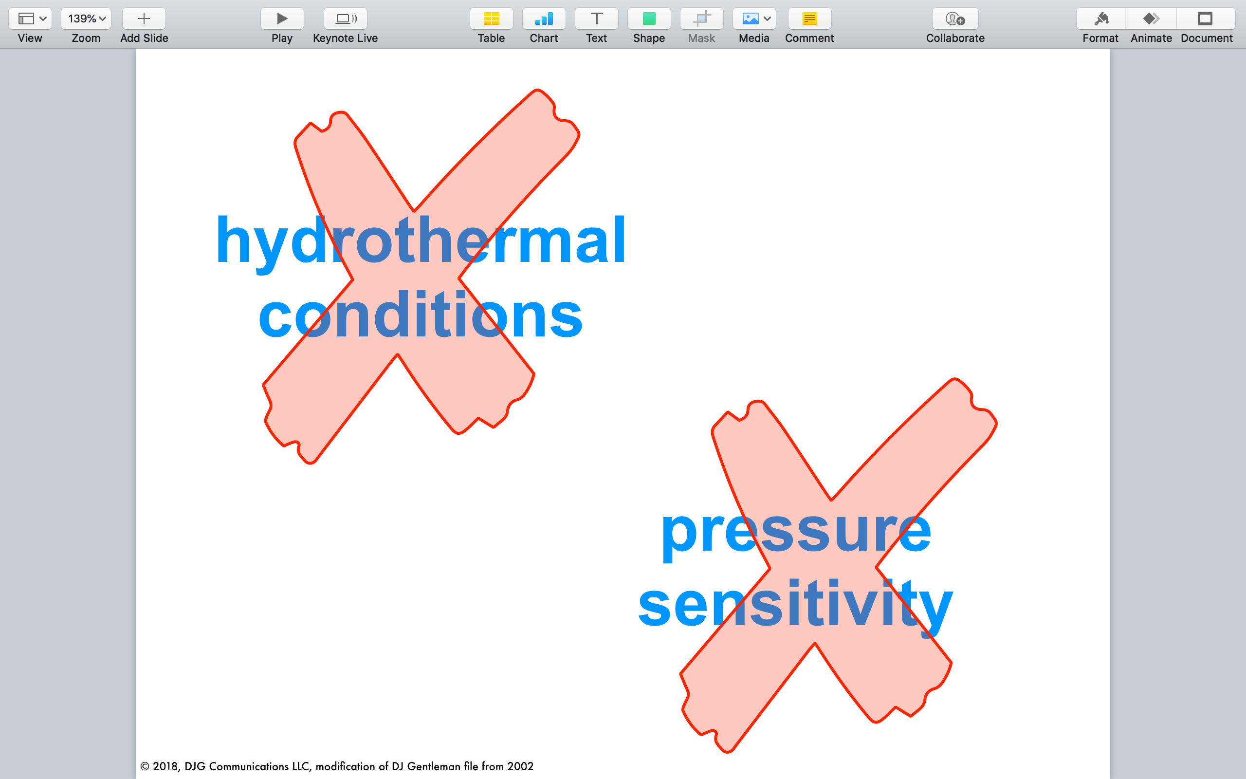
This slide was originally some spartanly distributed bullets under the title “Early Work”. At least I had the sense in the layout to create emphasis using white space, as though the audience would pause before they found the bottom line. However I have come to realize that audiences do not necessarily read slides the same way they would read text documents. So you need to give some sign posts.
Here’s my editing approach:
I cut the title because that’s easily said – “The first work I did …”
Then I took the intended meaning of the bullets and converted them into pithy two-word phrases. The point of the whole slide was to acknowledge experiments that rendered no useful results. So I transformed this sense of “did not work” into a graphical representation.
The graphics and text choice allowed me to space the words apart and make them very readable. I made the red fill-in of the X’s transparent so the slide does not need animation. Also if anyone is red color blind, the X will look brown or grey, but the shape of the X is undeniable. By the way, check out this clever color blindness site to see what your slides might look like for differently-seeing viewers.
The aesthetics I have chosen may be a matter of opinion, but this slide is easier to read. Also, it can hang out on the screen for a good amount of time while giving all the details as to why these experiments did not work. Why bog down my audience if it’s the slides after this one that need focus?
The road to hell is paved with slides that try to say too much.
Now for example 2:
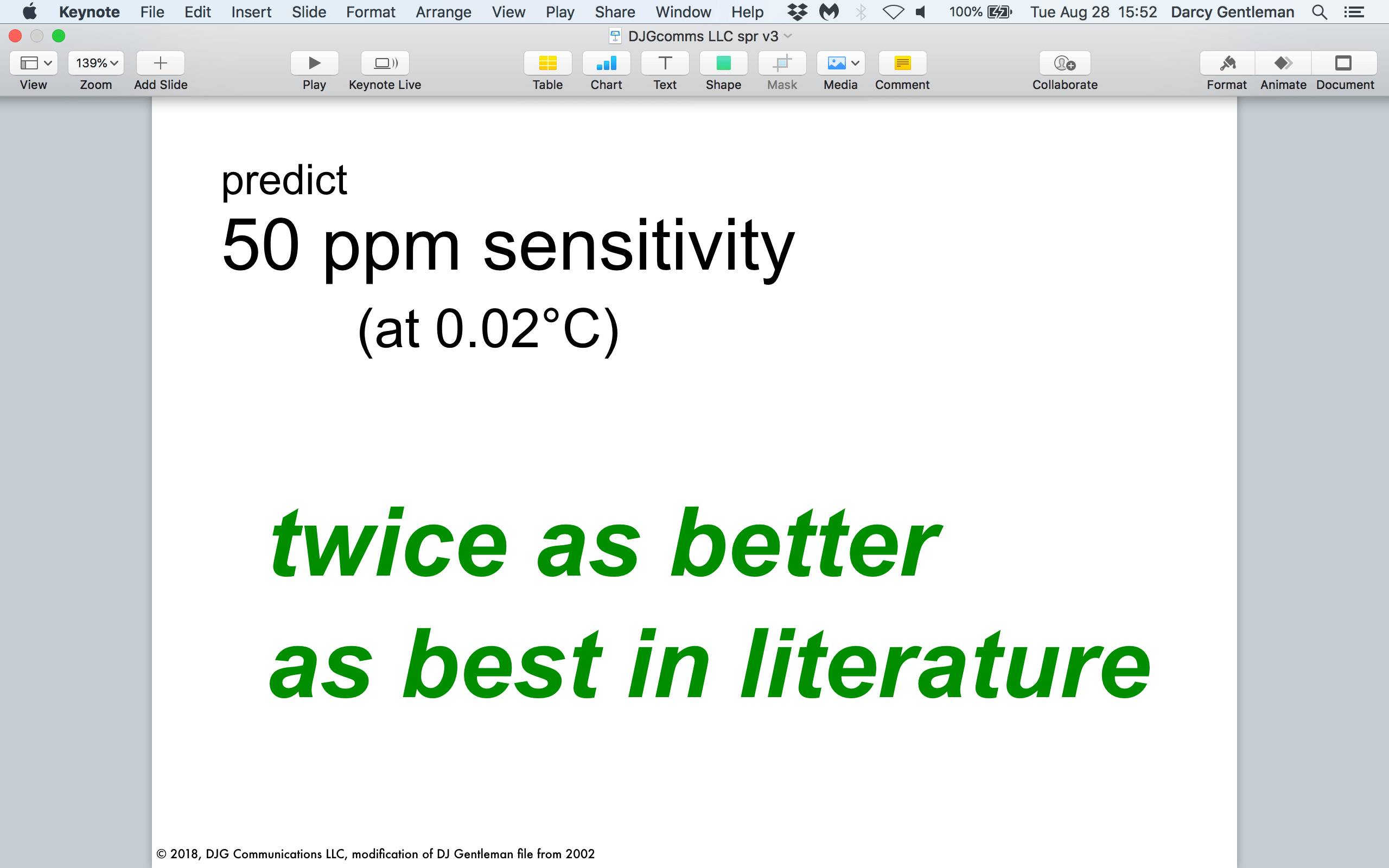
This slide is an important one as it summarizes several graphs that came before it. The take home is that “50 ppm sensitivity” is a great result. Without going into more words here, I think you can see how this slide, despite having a fair amount of text, is easier to read between text blocking, font size, and color. Remember, green means go.
Careful readers will note a subtle change on this slide compared to version 2: I moved the “~0.1 wt%” to the previous slide. There are a few reasons I did this (noting the below list gets into some scientific reasoning):
- the 0.1 wt% line was is in direct reference to the preceding graphs so this way it can hang on screen for a time, then push into the prediction on its own (50 ppm)
- it keeps one idea per slide
- one is error and the other is sensitivity – these are different in this context
- wt% and ppm are different units so it’s cleaner to put them on separate slides
- on its own, 0.1 wt% is a larger number than 50 ppm (it’s 1000 ppm) and this could confuse or frustrate audiences in the know
- frustrated audiences could make a rough time for you in Q&A!
- on its own, 0.1 wt% is a larger number than 50 ppm (it’s 1000 ppm) and this could confuse or frustrate audiences in the know
Use slide design to develop momentum in your favor.
“Here are. three. graphs. They say this (0.1 wt% error). So that means I predict this (50 ppm sensitivity). Now here’s how I’ll achieve that. Here’s a photo example. Here’s the plan.”
Above I have a period (.) for slides 14 to 21 in the revised deck. It seems a little breathless, and it should, because this part of the talk immediately precedes the central Q&A. The graphs might have bogged down the audience’s minds, so here I lift them out of that experience and take them through to my conclusion and the inevitable discussion.
A well-designed talk, especially one of a technical nature, can prepare both you and the audience for a better Q&A. If you are a scientist presenting to needfully skeptical colleagues or even competitors, guiding your audience can make for a far nicer presentations experience as opposed to bombarding them with data.
It’s okay to tell your audience when they can clap.
The last slide (before the references) says “Thank you.” It’s not arrogant – it’s relieving that weird tension when you say your last word then pause and the audience isn’t sure if they should clap.
If you’re giving a talk like this at a conference a “thank you” slide is a useful transition. I was once told that you should leave the prompt of “Any questions?” for the moderator or session chair. It re-affirms authority for the moderator to field the room for you. This is incredibly helpful if the Q&A starts to get a little testy. Also, saying “Any questions?” can have you come across as arrogant, which is very disengaging and disingenuous of your audience.
Put audiences first and end memorably.
Thank you!
Postscript
There is one slide in this revision that still looks pretty text heavy: the references slide, right after the “Thank you.” This is fine – it is there for those in the audience who want to see the references. It is separate from the slides you advance through, so you don’t need to worry how it is read. That said, use color and clear fonts to enhance readability.
If you’re giving a scientific talk where both the data and the references might need closer scrutiny by the audience, have hardcopy ready to give out when asked. But be sure you give it out at the end, not at the beginning. Giving the audience something else to distract their attention defeats the entire purpose of a presentation. Also, no one likes hearing rustling paper throughout a talk. No one.
Post-postscript
By the way, WHY should you cut bullet points? Leslie Belknap wrote a very informative post on this in 2015, which I would subtitle why bullet points are awful ideas in presentations. Summarizing Belknap:
When you see text you are compelled to read it. But text in a presentation means you’re dually stimulated by reading while listening to the speaker. Switching back and forth between sight and hearing is tiring and means you don’t really think about the information. [We do not multitask very well at all.] Not thinking about the information decreases the chance it will be remembered. Therefore to present a more memorable talk, show a visual that grabs attention, then tell the important information.
Presentations with fewer words will anchor more words of information in your audience’s minds.
Perhaps counterintuitive at first, but as you design and edit more consciously you will find elegance in style, better understanding by your audience, and more opportunities for you to share your ideas.
***
This is a series on showing a little of how I approach a slide deck from a client. Specifically in this case, a technical talk that I gave in 2002 as I was preparing to finish my Ph.D. in analytical chemistry. If you’d like to see the other posts in the series, check out my blog.


Leave a comment