


Ohhhh, graphs. Boon and bane of slide decks.
Wonderful visual inventions graphs are. Graphs, or “charts” as they are sometimes called, can pack sometimes thousands or millions of pieces of information into a layout that through patterns and geometry tells a story. I once worked with a scientist who said “A picture is worth a thousand words and a graph is worth a thousand pictures.”
But graphs in slides can be the downfall of an otherwise well-intended presentation. If you have a series of graphs in a row, the only members of your audience who are still on the same track as you are your direct colleagues. The people who are very familiar with exactly the sorts of graphs that you are showing. However if their day has been a long one, perhaps not even they may be following along like you think.
Why? Why are these visuals that can be so efficient at displaying a lot of data in a tight space be so awful in presentations?
Because graphs can be so efficient at displaying a lot of data in a tight space.
Graphs in slide decks are problematic, or at least require extra care, for two reasons:
- graphs were developed for the printed page and thus often contain design elements that are hard to see on a projected slide, especially if the graph is not on screen for long;
- you the presenter can easily forget that the audience may have never seen your sorts of graphs before and has no idea where to look.
Really think if a graph is absolutely necessary in your presentation.
Graphs, especially in talks with a lot of data, are like super-jargon. They mean a whole lot of information to people who are used to looking at that sort of figure. To others, there might be an appreciation of the general concept. But to some in your audience, a graph might just be seen as an elaborate picture, just as a niche jargon word is heard but not understood.
Do you want to risk frustrating the most important members of your audience because they are having trouble taking in your graphs?
One of the most useful concepts in putting audiences first is the “curse of knowledge” as explained by brothers Chip and Dan Heath in their critically acclaimed Made to Stick. You should read it. The curse of knowledge is also used by Alan Alda when he explains the need for clear communications to scientists:
It is very difficult to remember what it was like to not know what you know.
The graphs you use everyday are very well known to you. Perhaps you created them yourself. If you work in a technical realm, graphs might be more understandable to you and your immediate colleagues than lengthy pieces of text. That is fantastic. Graphs can be so useful.
But graphs can also be more opaque than discerning the artist’s message in an abstract expressionistic masterpiece. Your audience may have never seen the sorts of graphs you show. Even if they look at other graphs in their own work, they probably have not seen your graph. To you, “this graph” is the central point of your story. To them “the graph with the green dots” apparently is of some importance but it wasn’t on screen long enough to figure out exactly what.
Graphs are read by audiences very slowly: chances are a number will not finish orienting themselves before you move to the next slide.
This is the simplest reason graphs can be really bad in slide presentations: When you first show a graph, the audience’s eyes dart all over the figure looking for familiar meanings and sensical patterns. They will not look at the various components of the graph in the same order that you do. While you focus on the pattern of the data in your delivery, they might still be trying to figure out how the axes relate to each other.
Also, because you are almost certainly talking while the slide is up, the audience’s brains are switching between looking all over the graph and listening to you. Neuroscience tells us we do not multitask very well at all, so the uptake is slower than you think. Some in the audience might give up altogether and their attention drops out for the rest of the talk. This is exactly the same reason bullet points are a liability on slides.
Think of it this way. When is the last time you saw a graph on a billboard? If the medium is something you look at quickly you will probably not see a graph. Or the graph will be so simple it is a visual abstract.
Therefore, if you are going to show a graph, remember that the audience is going to take it in slower than you think.
Redesign your graphs to make sense to someone looking at it for the first time without your oral guidance on where to look.
Let’s have a look at how this could be done with one of the slides from the data I have been showing in this series.

This is “version 3” from the editing text post preceding this one. Let’s focus on slide 11:
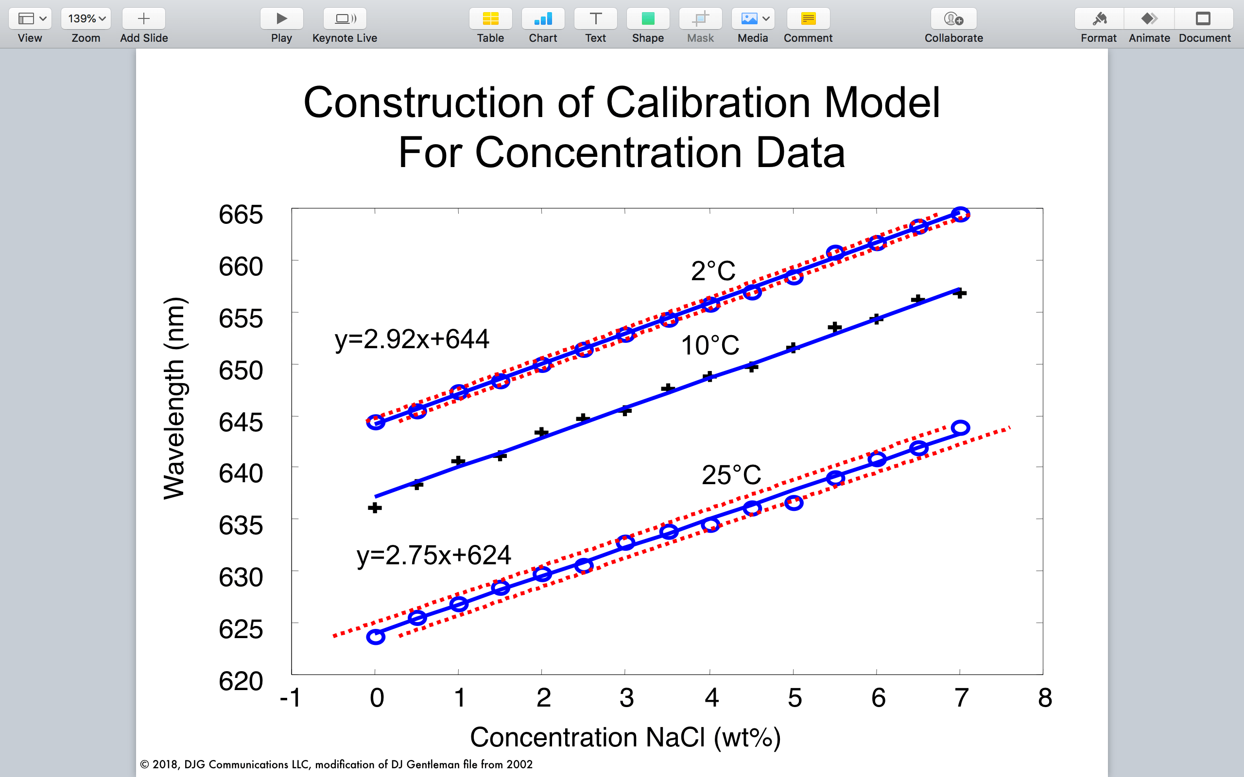
First let’s move around the graph to show just how visually complicated this thing is. Count up the design elements, which I’ll put in bold below:
title – why does it say model? this looks like a graph! oh no, do I have to remember what this thing looks like for the rest of the talk?!?
vertical axis – numbers and ticks. hey, why doesn’t it start at zero?
vertical axis label – wait … wavelength in “nm”? not frequency. what’s the conversion again?
horizontal axis – more numbers and ticks. hey, why does it start at -1?
horizontal axis label – what is ‘nackle’ again? salt? and what are the units? it’s hard to tell from the back row here. oh wait, this talk is about seawater. so where is seawater on this graph? did I miss that?
two equations – is that a ‘y’? is that the nm thing? something to do with geometry? not sure I remember how those equations work. even though I should.
three temperatures – wait – temperature isn’t one of the axes. what’s up with that?
two diagonal lines with blue circles and red dots – wait, so the red dots are part of the data too? or maybe that’s a geometry thing. statistics? wish I could remember. wait – why are they closer together on the top line than the bottom line?
single diagonal line with plus signs – what is so special about 10 celsius that it gets plus signs? and why plus signs?!? wait – that line is the 10 celsius line, right? well, the 2 and the 25 are above their lines, so the label must be what is on top of the line. but really, what is with the temperature? oh wait, I think he just said something about temperature.
oh no – next slide!
The italics above are perhaps the little rambles some audience members have playing out in their heads on seeing this slide. Perhaps you’re saying some of these.
Distracting, right?
Now, if you are a research scientist you’re saying right now this does not bother you. Although you may not have seen this exact graph, you know your way around a graph or ten. You can figure it out. But how confident are you that you would figure it out if it were up for just 15 seconds? Or even a minute while I am talking about other things.
Still not convinced? All right, start playing this YouTube video from CNBC. Once it’s playing out loud past the 19 second mark, have a look at this graph from The Economist for 15 seconds. Then look away. Did anything make sense? (assuming you’re not an authority on German elections).
This barrage of information is what audiences can feel if you do not redesign your graphs for their benefit.
Back to my calibration graph. Here is a simpler way of showing this graph:
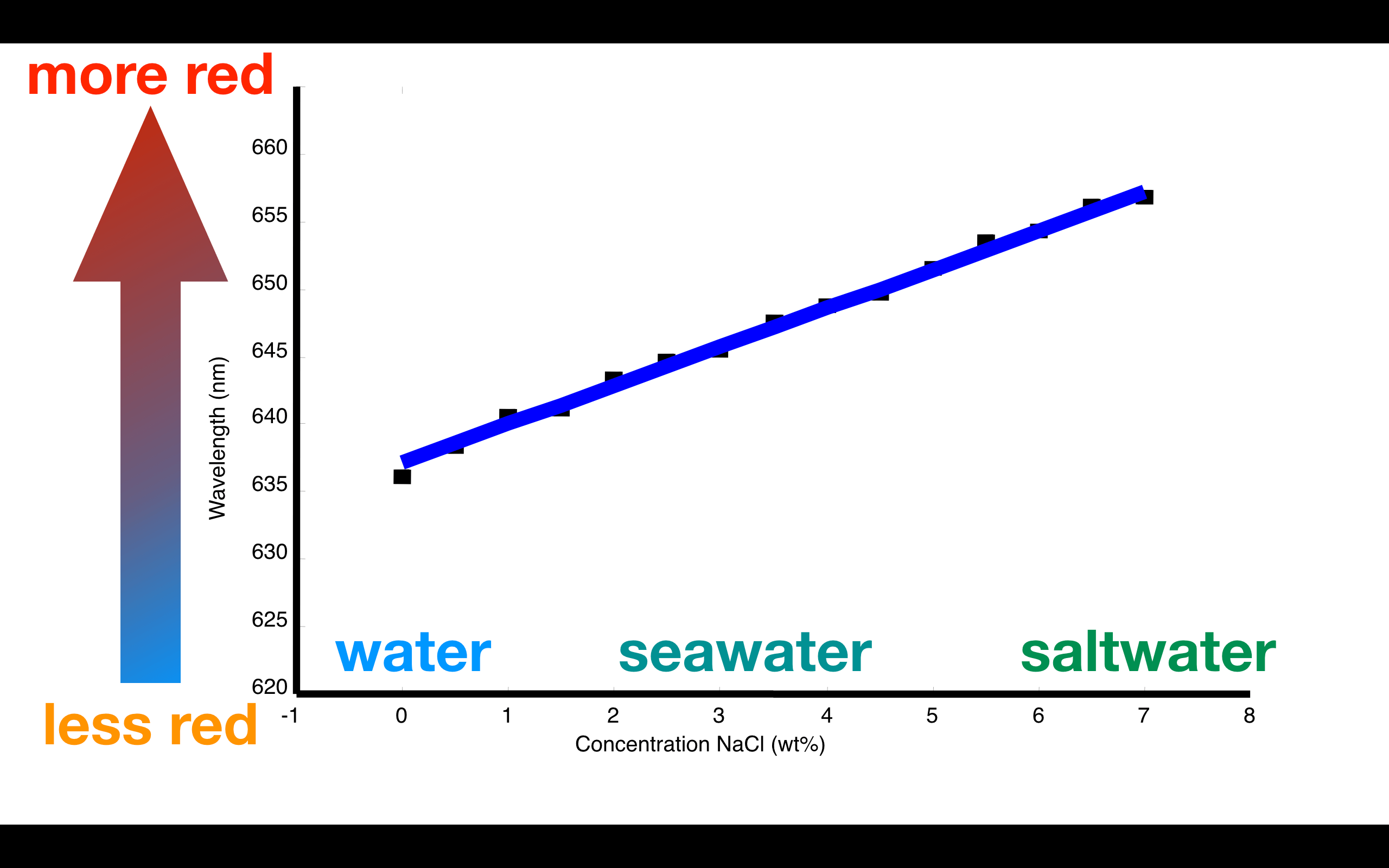
Here is what I did:
Just like I recommend with text slides I have removed the title – you say that in your oral remarks and it allows you to make the graph bigger. To help viewers understand the axes I have labeled them with colorful and large text explainers. The vertical axis tells us that the color goes from less red to more red; the horizontal axis indicates saltier water is to the right. I only show one of the lines, meaning I do not need the confusing temperature labels. (I could animate those in on a subsequent slide). I have made the line thicker and simply used dots instead of plus signs that might distract attention.
This is still a calibration graph, but it highlights what viewers need to remember for the data following this slide.
Let’s take this sentiment further: why not just show those larger annotations, since I’ll be accompanying them with my oral remarks?
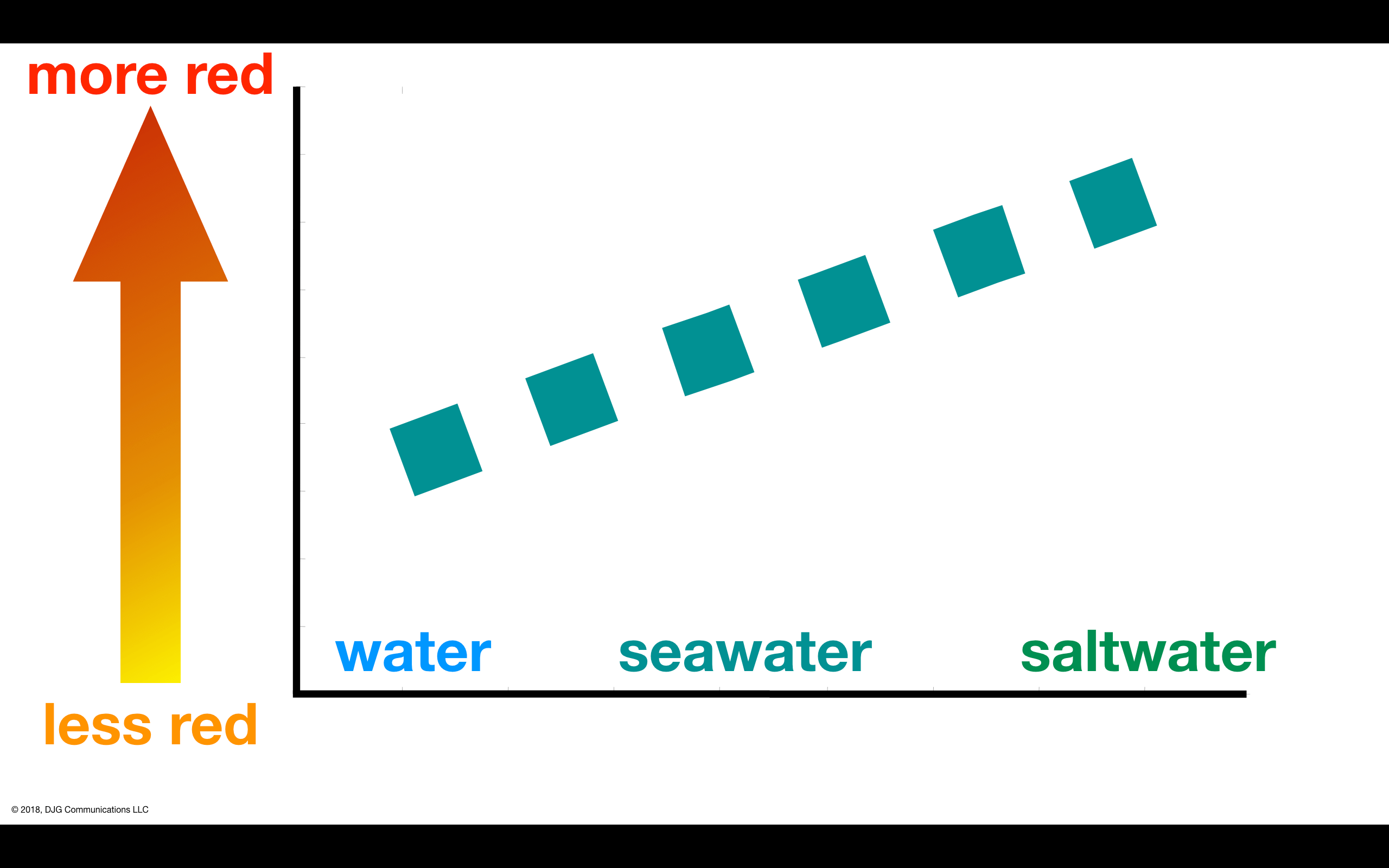
Notice here also I have taken out some more confusion – I said in the first simplified version that the vertical axis goes from “less red to more red” but then I had blue going to red. Spectroscopists know that the numbers (in nm) I was showing were nowhere near blue light, so it’s more accurate to show going from orange to red. For viewers who might be color blind, I double the colors with clear text.
You can look at this graph for just a few seconds and with my saying “this is a calibration curve relating red light to water salt content”, get the gist. This is the visual equivalent to substituting more common words for niche jargon.
Incidentally, this version also solves a pesky problem with graphs: dark backgrounds are better in dim conference rooms, but many graphic programs put a light background behind the data. Since I have drawn over the original data (axis lines and data lines), I can flip the colors quite easily for a crisp graph:
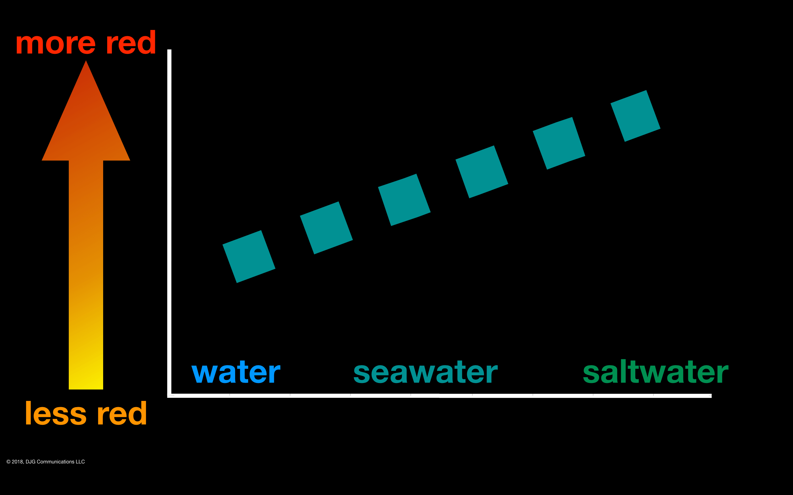
Now, if you are a scientists or engineer you might be freaking out a little at this “graph”. There are no numeric labels on the axes and the data is now so abstracted to look qualitative.
This is the entire point. By showing the quality of the quantities I can apply design elements that make this informational visual easier to take in, and reserve your valuable attention for the more centrally discussed data to come. Only if this entire talk was about the calibration procedure does this graph really need to have the high detail it did in the original form.
Whenever you think “I do not necessarily need to show this” cut it from your slides.
In many talks you could simply say “we calibrated our instruments to know what a given color of red corresponds to what concentration of saltwater”.
The scientifically radical version of this re-design might look like this:
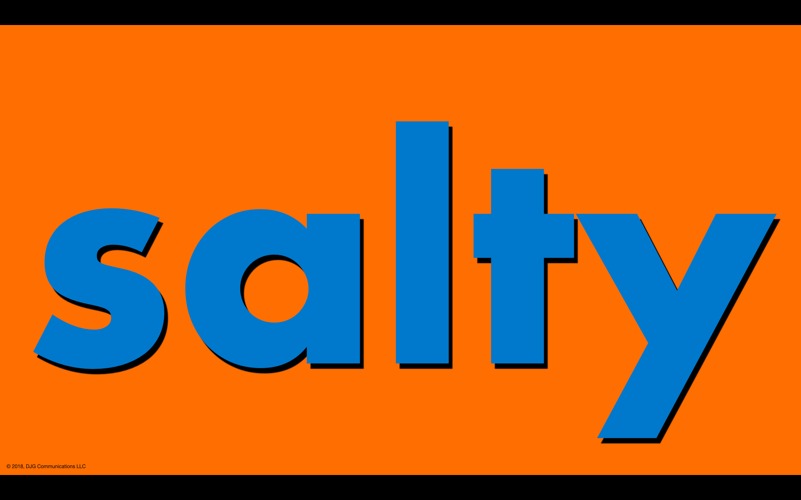
This slide says “the more orange [or red] the light, the saltier the water”. (Note I used orange because it has a bit of yellow in it, so it is a little more discernible to viewers with red color blindness).
You can show what a graph says without showing a graph.
Why burden the audience’s minds with all the disorienting confusion of a graph they have never seen when really you do not need to show it?
Scary, I know. Especially to those of you who think of graphs as essential commodities of information. But think about it. If you are going to show several graphs in a row, why waste the audience’s time with data set up if you want tight attention on the most important image?
Certainly, put your audience first in making these decisions. This particular talk was for an audience that was judging my technical understanding of concepts like calibration curves. But perhaps the first revision would help them move around the graph – maybe if the colors and temperature annotations were animated in as a quick guide for how to look at the graphs that follow.
Use the tools available to you in slide software to make superior slides … but do not over-use them.
In part 2 of this post I will show how really thinking what slides need to show can centralize attention on the centrally important data. Even if they are graphs.
Too Clever By Half* Postscript
Graphs are like the tragic (anti?) hero Coriolanus, according to Shakespeare scholar Philip Brockbank,
the essence of [graphs’] nature [is] at once [their] virtue and [their] vice
*as my late Yorkshire grandfather would say
***
This is a series on showing a little of how I approach a slide deck from a client. Specifically in this case, a technical talk that I gave in 2002 as I was preparing to finish my Ph.D. in analytical chemistry. If you’d like to see the other posts in the series, check out my blog.


Leave a comment