


Pulling together the thoughts from Part 1 and Part 2 of Graphs on Slides:
Compare version 1 (original) to version 2 (edited for slide type) to version 3 (edited for text) to version 4 (edited for graphs and figures):


Uncluttered slide design lets your talk breathe with meaning.
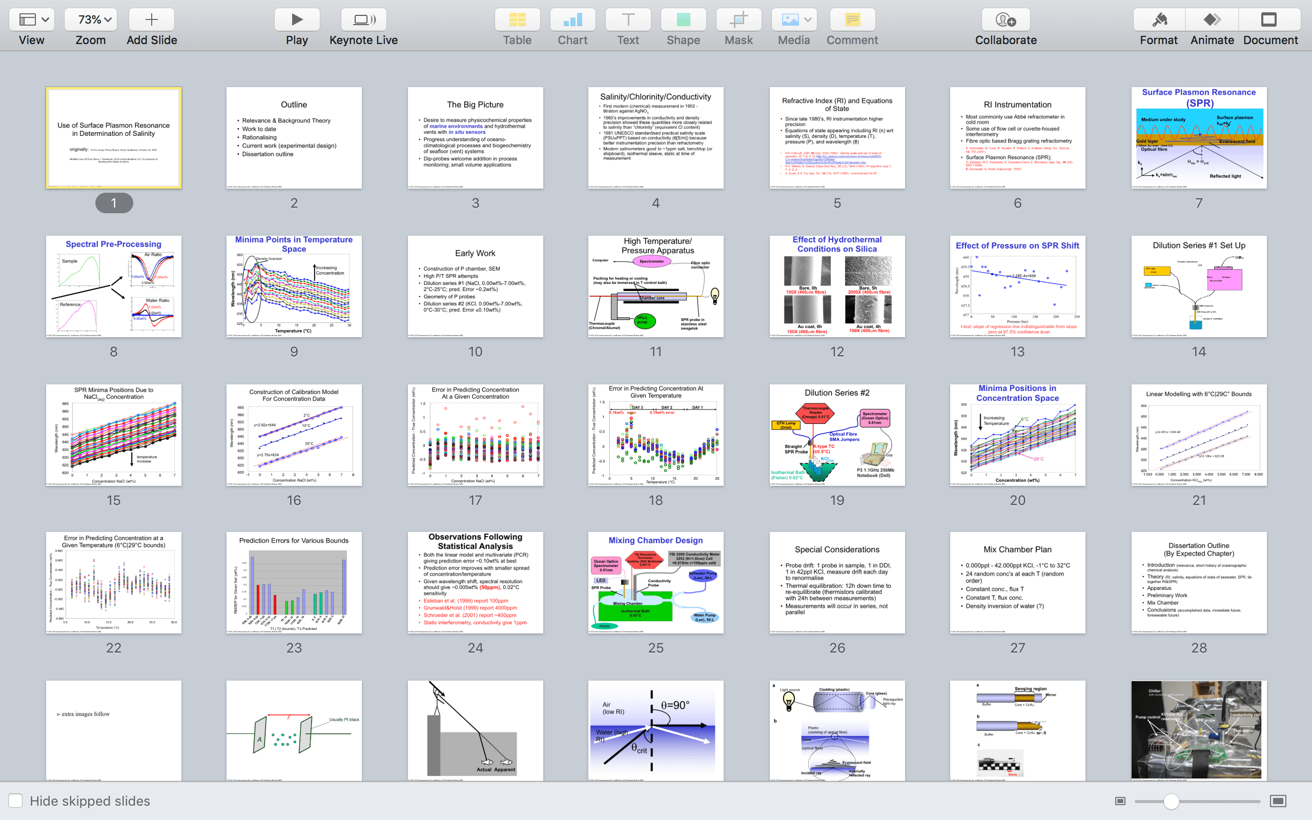
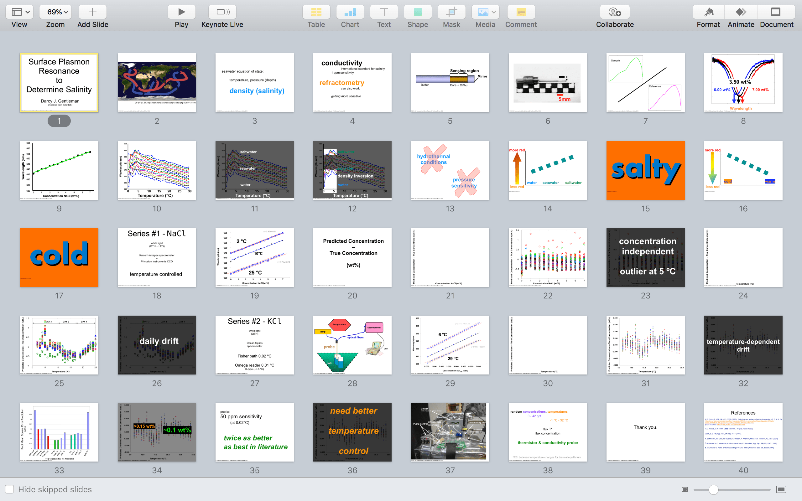
Version 4 (immediately above) is a far superior deck compared to version 1. A quick check is the ability to tell the gist of each slide from this all-slides view. Version 1 requires a lot of squinting while version 4 has a clear and graphical logic. To my eye, at least, Version 4 literally looks less dense.
If your own slide deck looks dense to you, think of how it looks to an audience who has never seen it before. That thought alone should push you to revise.
Recall that the audience for this talk was a set of professors. The content is technical but the slides need not look technical. Arguably the more technical a talk is, the less technical the slides should look. It is the oral component that fills in the details. Presentations are literally multimedia: visuals and sounds. If both are technically dense, the audience strains to take everything in.
A detailed talk with dense slides competes for its own attention … and loses the audience.
Let’s take a tour through the talk and I’ll note how the slides could be delivered:
Set the context for the audience you are targeting, not every possible audience.
I have removed the theory slides because this talk is about the data and its analysis. Even if I had an hour (I think I had two), the more content that is packed into the introduction, the less the attention the audience will retain in the middle where the good stuff usually lives in technical talks. An audience that is not paying close attention will not remember the content. (Tune in to the next post for more on how to hack this psychological reality of audiences’ attention.)
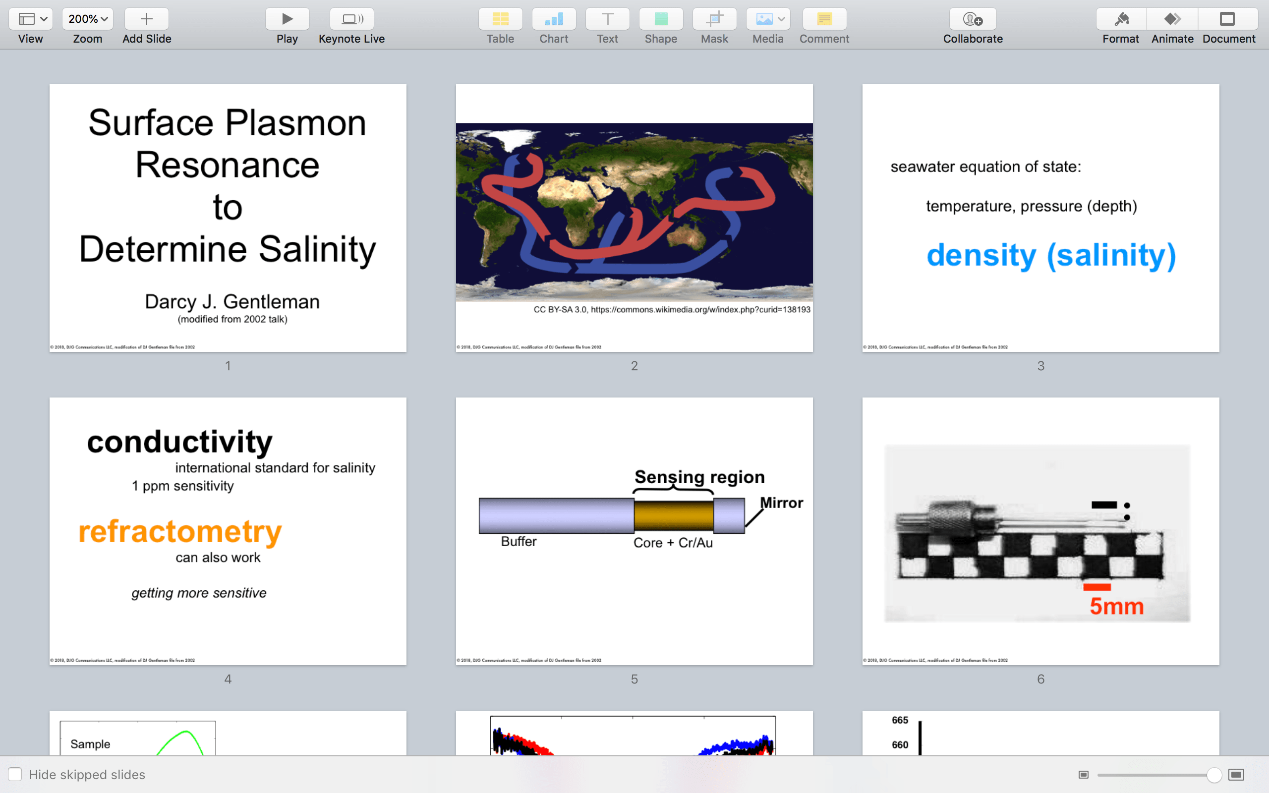
Note on slides 5 and 6 – I am using the originals I created for this talk in 2002, which were constructed 16 years ago on (I think) PowerPoint 97. For the purposes of showing how a slide could look in concept, slide 5 looks fine for this blog. I am not a trained graphic designer and I am not adept with software like Adobe Illustrator. Slide 5 is simply rectangles with gradient fills to give the cylinder effect. This is the level of design for all the graphics in this slide deck. (I revised in Keynote for this blog).
Some speakers like to have professional graphics as one would see in a high production value magazine such as Scientific American or National Geographic. Unless you are a graphic designer yourself (and even if you are), deciding to include such content will add large amounts of time to your preparation. Time you may not have.
Put your audience first when deciding how fancy to make your graphics.
Before you undertake significant graphical revision time ask yourself: will the audience understand the entire talk better if this one slide looks prettier? Chances are that the audience will not understand the whole talk more. Also, chances are that you could use that time to make the entire deck better – edit as I have shown in this series.
Note that I have worked with graphic designers on YouTube science videos and I have nothing but respect for the gorgeous work they do: Props to Sean Parsons, Elaine Seward, and Kirk Zamieroski. These videos can take weeks to get right, from inception to release, and look all the better for it. Sophisticated and time-consuming (motion) graphic design are vital for these videos because they are created for an audience that demands a higher production value.
It is often better to delete a bad image than to try improving it.
Slide 6 is a low resolution photo but there is no way I can take that photo again today. For the purposes of showing the slide design compared to version 1, I am keeping it here. But in general: Avoid pixelated images in your talks. The obvious blur distracts the audience’s attention. They might also think that you did not care enough about the image and by extension themselves, the audience.
Spreading dense content across three slides makes a little story that flows in delivery and is more memorable.
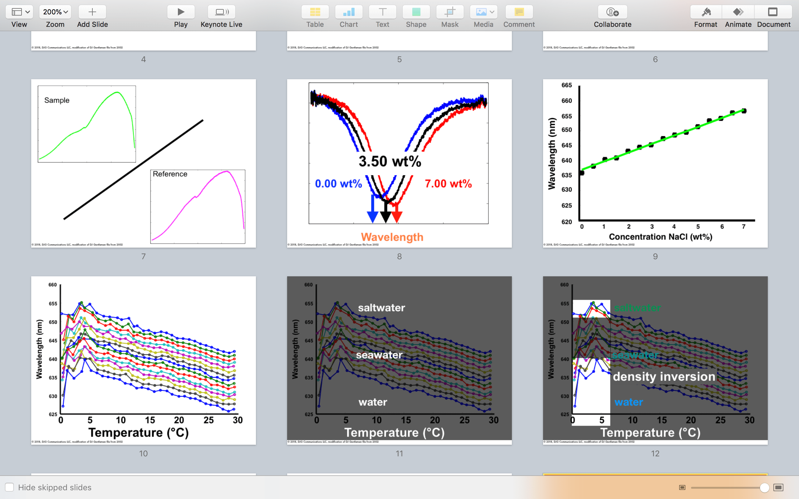
Slides 7 and 8 used to be one slide with an additional graph. The purpose of the original was to show how the data is collected and processed for analysis. By breaking this graphical content up then abstracting one of the data slides (into now slide 9), there is now a three slide arc: slide 7 shows what the raw data looks like; slide 8 shows how it is processed; slide 9 shows how it is analyzed.
This is a three act play of data analysis. It is a story that follows the “ABT” structure popularized by Randy Olson: here is a sample and the reference AND they look similar BUT if we ratio them we see a shifting minimum THEREFORE we can plot that shift as a useful measurement.
Slides 10, 11, and 12 are showing something that version 1 tried to demonstrate in a single slide. By quickly showing, then shading out the busy graph, the audience’s attention is focused on the high contrast text that clearly explains the graph’s core meaning. Highlight boxes mean you do not need to use laser pointers. Never use laser pointers.
Show the audience where to focus their attention and reward that focus with accessible design.
Some of you might say this trio (slides 10-12) could be animated off just one slide. This is very true. However I tend to get lost (and burn time) when I’m trying to cleverly animate a single slide. If I can get a similar effect by spreading the content across several slides, I do that: Mechanically I copy the slide, then add/delete the elements that are “animated in.” I am careful to nudge the positions so there is no perceived spatial movement of the figures as the slides advance/reverse.
Regardless, the different layers of animation are essentially new slides. That is how pre-computer animation was accomplished: adding a drawn picture with a slight change over a steady background. I find it is easier to work across several slides because it is far less frustrating than keeping track of all the animation layers. All I have lost are cinematic transitions.
Also, avoiding complex animations means if someone asks you to go back through your talk in Q&A it does not include that annoying march back through all the animations.
Less frustrating revisions tend to result in cleaner edits and better talks.
Slide software can be really useful, but if you are not adept at every aspect, do not sacrifice good for unattainable perfect. Chances are you will do a disservice to some other portion of the talk when it takes longer than you expected to make just one slide extra pretty.

Editing guides creation of clearer content as it removes chaff.
Slides 13-15 have been covered in this series previously on editing for text and simplifying graphs. Slides 16 and 17 repeat this approach, now applied to another aspect of this specific data that was not easily explained in the original – temperature. Sometimes when you look at your slides in a new way, how to fix other portions of the talk become obvious. A reminder: I am not covering the meaning of these slides in these posts.
Only if you look at version 1 above is it clear that slide 18 turned a graphic slide into a text slide. That’s right – I added text to remove pictures. Sometimes this the best choice so that the types of slides in a presentation change, which prompts the audience that they are now in a new content section.
In this particular example, the graphic of the experimental set up did not add a lot of information to this talk about data. Also it was drawn poorly and it did not make sense to make it nicer when it could easily be presented differently. Also, this talk now has more graphics, so it is a good idea to have text-only slides now and again.
Use shaded overlays to tell the audience where to look.
Slides 19-21 draw lessons from the previous post on how to make a graph most useful if it is highly necessary.
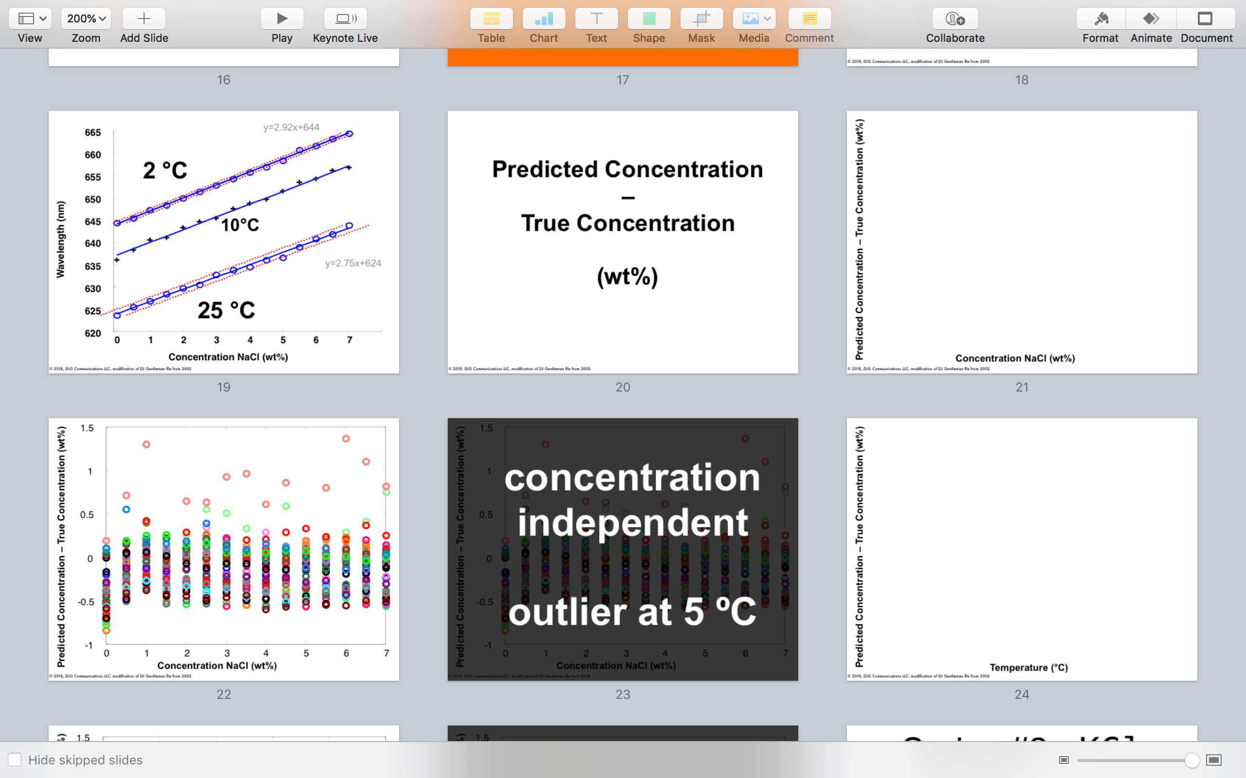
Slide 23 is a new concept in slide design – the shaded overlay – introduced at slide 11. Slide 22 is really complicated: It only means a lot to the writer of this talk (me). The audience has no idea where to look first when confronted with slide 22, despite being walked in with the meaning of the axes (slides 20-21).
Redesigning complex graphic slides is where you need to remember first and foremost that talks are not papers. You have got to show the audience where to look.
I would show slide 22 for just a moment, then within seconds go to slide 23: The audience’s eyes will take in the complexity of slide 22 just enough for their brain to think “this slide has a lot of stuff on it.” Then, as if by magic, they see the words “concentration independent …” and now they know all they need to proceed in the talk.
By using the shading, the connection between the words and the (faint) graph will start to gel even though the audience cannot see the whole graph. Depending on the delivery, I could then go back and forth between slides 22 and 23, and have a discussion with the audience on what the graph is showing. Again, audiences first: this slide design is informed by the context of this talk. For a less technical audience I would probably not show slide 22, or at least relegate it to after the “last” slide, should someone ask questions along those lines.
The cutting room floor might hold gems if you look at them in a new light.
This shading approach is repeated on slides 25 and 26. Note these were deleted from version 3, as my thinking then was the story was clearer without them. But mindful revision can reveal how to show content that previously defied clear explanation.

In technical talks, design slides to aid discussion and stoke memory.
Slide 27 echoes slide 18 in laying out the experimental set up. This repetition can reinforce the arc of the talk taken in by the audience, with signposts to where this whole thing is going. Repetitive structure will also mean they recall more of the presentation when they think about it later. As neuroscientist John Medina says “repetition fixes memories“.

Create some slides to stay on screen for a long time.
Slide 28 graphically follows the experimental set up laid out with text on slide 27. Here I have cleaned up the figure a little (not as much as I could, as noted above in time management where graphic design is concerned). Here I am showing the same content twice because that emphasizes the importance of temperature in this portion of the talk. Also, this is why I added slides 25 and 26 back in – concept foreshadowing.
The design of slides 29-32 look familiar by now, so the audience can get through them quickly. Also, the shaded overlay of slide 32 stills the mind of the audience: This is very important given the next slide.
Slide 33 flies in the face of the slide design I’ve presented here: it is not simple and it is not presented with a different version of itself immediately following. But I made this choice very consciously:
Slide 33 is designed to stay on screen for a long time. Several minutes, in fact. It is a discussion slide, not a quickly show and tell slide. The data on this slide is the impetus for the third experimental design that follows this arc. It told me the direction to take the experiments that resulted in my ultimate doctoral thesis. Slide 33 is a core science slide.
I have simplified slide 33 a little from its original version: the title is removed and also the grey background of the plot. But all the annotations stay because I intend to keep this slide up for a long time and have a discussion with the professors looking at this talk. Audiences first.

Constantly revise: Change slides if they stop working well through deck edits.
Version 3, edited for text, had a single slide saying “0.1 wt%” and I explained my thinking there. Having redesigned and restructured to draw a lot of attention to slide 33, it was important to remind the audience where this “0.1 wt%” number came from and what it meant.
Slide 34 therefore pulls back slide 32, now including a result informed by the discussion on slide 33. By consolidating the text of the data to where it is on the graph, I am showing the audience (professors) my scientific conclusions. In focusing their attention I focus the content and get ready to push the talk’s momentum forward into the concluding slides.
Slide 35 strikes a hopeful note, but then slide 36 echoes back again to slide 34 (and thus slide 32), showing the data that will inform the future experiments. This is how science is done, and I am (was) showing the audience that I know what I am doing. After all, this was an academic assessment of scientific research.
Audiences first.
Then I conclude with slides 37* and 38, which are a mirror version of slides 27 and 28: Show the experimental set up then indicate the experimental design with text. This is because slide 38 is another discussion slide: it will be on the screen as the presentation becomes a lengthy Question & Answer session (45 minutes at least).
In fact, slide 39 (“Thank you”) might never actually get shown (let alone slide 40 – references). Slide 38 is entirely appropriate to hang out on the screen for this particular audience.
Revise. Rest. Look again with beginner’s mind. Find the story.
The above is a lengthy go-through of my slide redesign thoughts for this old talk. Throughout I had notes on how the audience’s attention would be focused and better treated by these new slides.
Note however this redesign did not significantly change the order of the slides from version 1. Therefore the next step is to consider how the narrative structure treats the audience.
That is for the next and final post in this series …
*Note this is a cheat for the present purposes: the photo was taken after this talk was given, but I use it here to show how information like that could be useful. Also note the photo is blurry – I would retake this today if the set up still existed.
This is a series on showing a little of how I approach a slide deck from a client. Specifically in this case, a technical talk that I gave in 2002 as I was preparing to finish my Ph.D. in analytical chemistry. If you’d like to see the other posts in the series, check out my blog.


Leave a comment