


Film is the best inspiration I can think of for presentations because they use the same sensory stimulation: sound and vision*. Therefore, the order of your slides in a presentation should fit a narrative structure, just as the scenes in a movie fit a story.
Presentations are visualized stories. Regardless of their content.
For the slide deck this series has focused on, and now concludes, here is a simple hack you can perform to most science talks I have seen to make the narrative more interesting:
Here is the original (version 1):

And here is the version looking to improve slide design (version 4):

Looking over the lengthy post of creating version 4, I noted that slides 31-33 establish the case for the experiment that followed this presentation. Therefore slides 31-33 represent the core message of the talk: “given these results, here is how I will proceed.” The core message is the entire purpose of the talk.
This experiment proposal was so essential to the talk that in revising to version 4, I created new slides to follow slide 33, emphasizing the temperature drift conclusion.
So without further ado, the presentation hack to maximize attention, leveraging narrative structure (version 5):
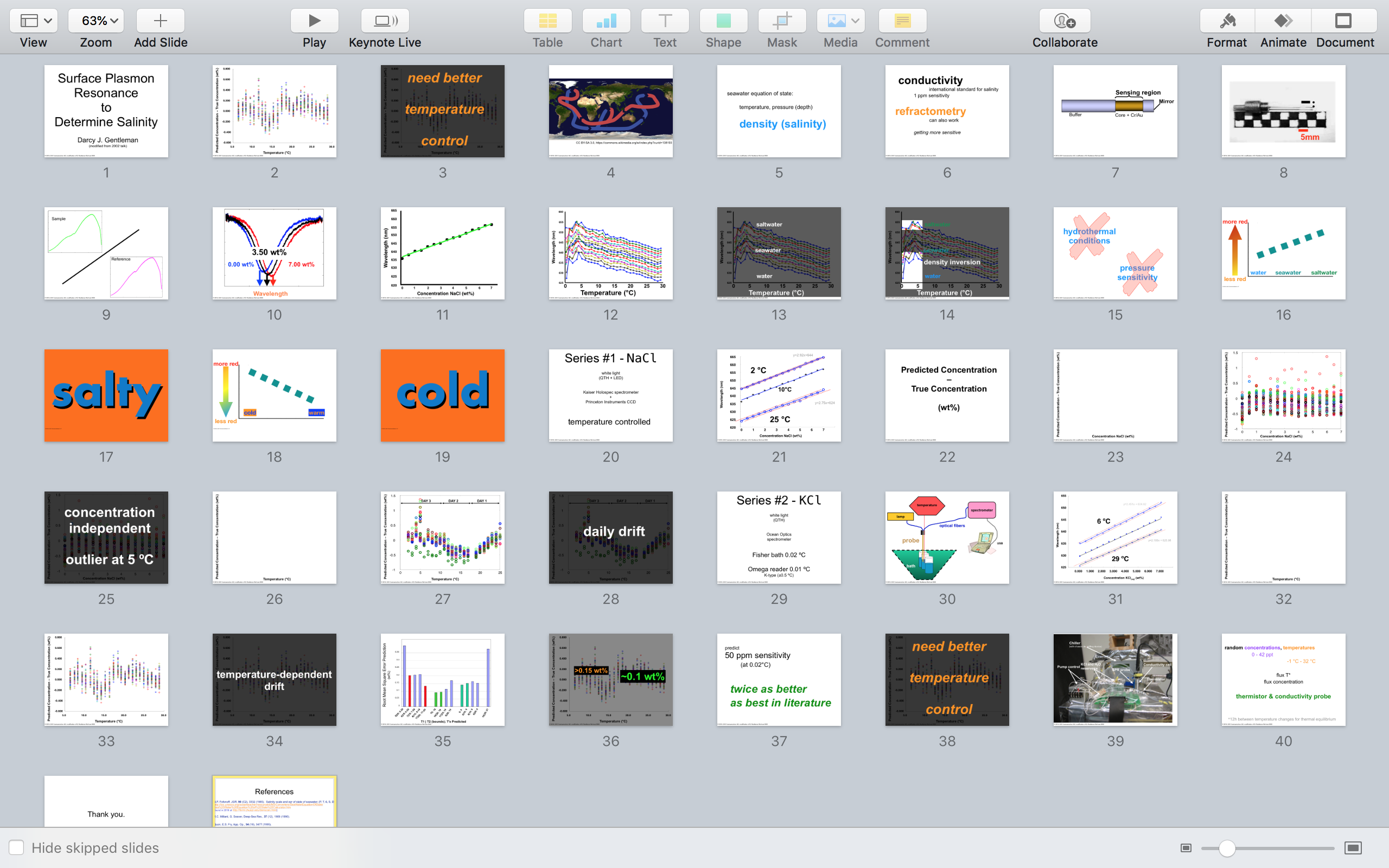
Do you see the difference compared to version 4?
Slides 31 and 36 from version 4 are copied and pasted to the very beginning of the talk. Here is a closer look:

The way I would deliver this (slide numbers below):
- Welcome, thank you for coming. Today I’m going to share the work I’ve done to date and propose the final set of experiments, in planning to defend my dissertation next spring.
- Essentially, the most recent results show a temperature-dependent prediction error
- If this sensor system is to prove useful the source and possible remedy to that bias needs to be determined. Based on the experimental design to date, this tells me I need better temperature control.
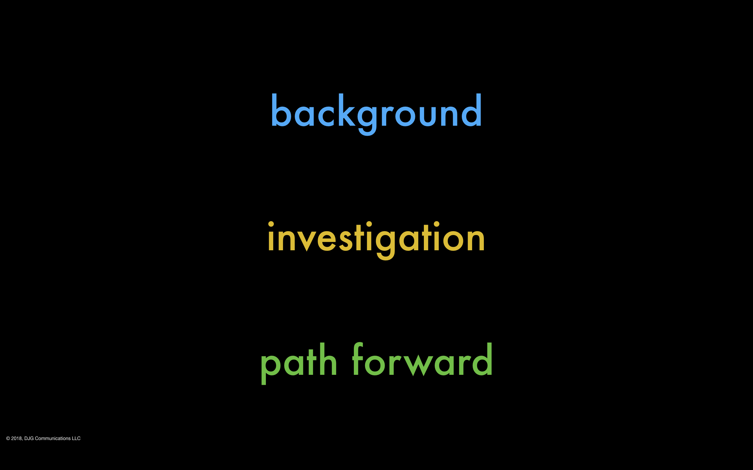
- To understand my reasoning, some background. In order to inform ocean climate models …
From a narrative structure standpoint, this does several things:
It uses what military presenters refer to as “BLUF” – Bottom Line Up Front. I tend to think of this as starting in the middle – showing the results that are most central to the scientific context.
When I give workshops on how to improve presentations, I demonstrate this approach for scientists/engineers as follows:

That is, the reason the talk exists, especially in scientific research contexts, is that you hit on a “weird” result that attracted your attention, and in determining its weirdness, you uncovered an explanation which led to this scientific finding you are now presenting.
You came into the story at the weird finding, so why not start your talk there?
Begin science talks “in the middle” to engage your audience.
In science, this puts the excitement or confusion of a discovered result up front, without any context. By sharing that excitement, your audience will be enthralled and their curiosity for the talk’s potential piqued. But you do not resolve that curiosity until the middle of the presentation.
Narrative tension is incredibly attention-focusing.
Also, by repeating the same slides – the centrally important slides – you are making your content more memorable. As I noted in the previous post, neuroscientist John Medina says “repetition fixes memories“.
Notice that the rest of the talk remains in the same order. I advise many scientists that this hack can make their traditionally ordered research paper presentation all the more interesting. It should not be that alien to scientists in general – it’s the same structure that a research paper has if you consider the abstract up front. That’s BLUF, for scientists:
You keep the audience’s attention higher listening to the background that otherwise can put people to sleep. Then you deliver a psychologically pleasing pay-off for that attention in coming back to the curious finding. Finally, you use that gratifying momentum to take the idea into its future. Other scientists in the audience will be champing at the bit to discuss with you. Perhaps to collaborate. Funders will be drawn to the potential for your research. Your talk will stand out amidst traditionally organized science.
So why do I describe this approach as cinematic? Because I think many films exemplify this same approach: capture attention with a “non-linear” structure that maintains narrative tension longer. It makes the dull not only interesting but captivating.
With this cinematic inspiration, I sometimes refer to this presentation hack in my workshops as a “flashback” structure:
- start with a scene seemingly out of context;
- jump back to explain the context;
- return to this “beginning” (which is really the middle);
- now take the audience to the conclusion.
That audience has been taken for an emotional journey – who is this person? They are in peril! Tell me how they got there! Oh no, the peril is coming up! Here’s the peril! Now go forth, my friend!
A couple of films that use this structure, choosing across genres:
Good Fellas – starts with Ray Liotta’s character in the mob handling some peril, then flashback to his childhood looking like Norman Rockwell, yet imperiled
The English Patient – starts with the war raging around Juliette Binoche’s nurse and her masked Ralph Fiennes patient, then back to before the war began when he wore different sorts of masks
It is a narrative method that has gotten a meme treatment of late on YouTube, with the record-scratch audio / screen pause of “how did I get here?” Oh look, here’s a science communication example about marathon running.
Did movie producers invent this approach of starting in the middle? Hardly. It is a long-used literary structure called in medias res, famously with Homer’s The Iliad. I’ll return to that in a later post. Consider this post that future post’s middle 😉
This longevity tells you the power of this narrative hack: the “flashback” structure exists throughout literature over millennia. In medias res is a powerful method to capture the audience’s attention and have them remember the story. As “good artists copy, great artists steal” you should use the techniques in your talk that have shown high effectiveness in other media.
This is why I teach in medias res in my workshops and I often recommend it to individual speakers that I coach:
Put audiences first to be remembered in the end.
In summary, this series has shown that I practice what I preach: using a slide deck from my own history, given only once 16 years ago and never to be given again. But through this series of heavy edits and revisions, you can see my approach of how to make even technical talks more accessible to their technical audiences. Just because it’s science does not mean it should avoid literary structure. Every talk that wants to be remembered by an audience should use literary structure.
Here are all the posts in order for your ready access:
- Practicing What I Preach on Slide Design – The Start of a Series
- Audiences First Design
- Editing for Slide Type
- Editing Text Slides
- Graphs on Slides
- A Series of Pictures Make a Movie (this post you’re reading)
Please go back through the previous posts, and tell me what you think – I look forward to hearing from you and perhaps working together.
*thank you David R. Jones


Leave a comment