

My recent posts have focused on how audiences first design makes presentations better, even a technical scientific talk. In the final chapter of that series I looked to cinema as inspiration for attention-grabbing narrative.
Today then, as an interlude from lengthy posts, here are a couple of resources that might inspire you to design your slides’ visuals with cinematic regard. These apply to any presenter in any subject, from the arts to zoology.
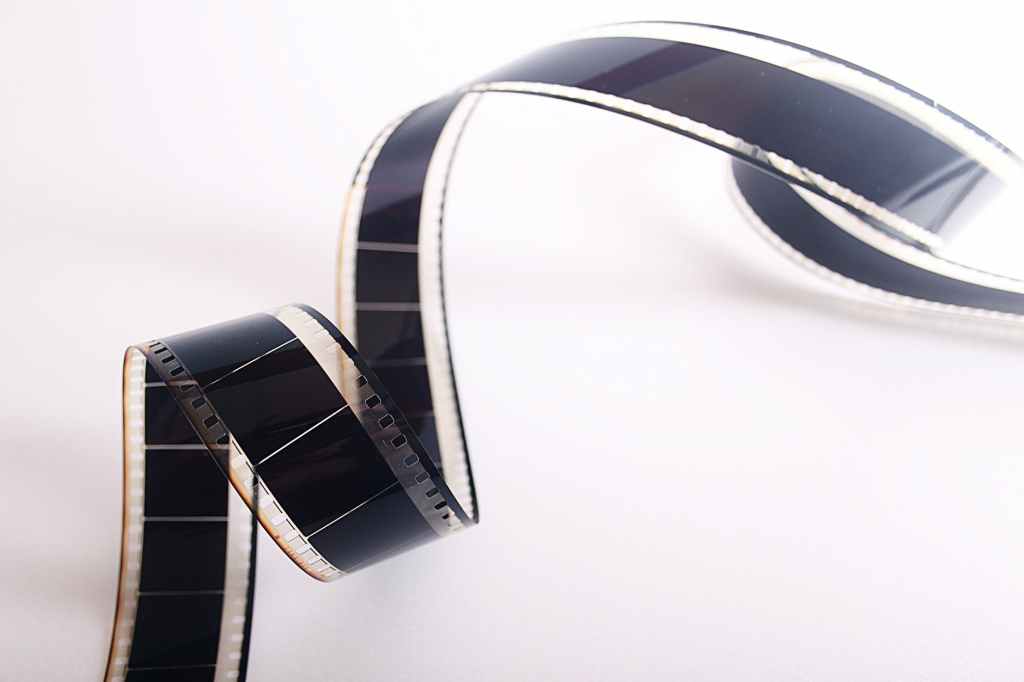
Although film is a moving medium, its stills are master classes in slide design.
For longer than I realized it, I have loved fonts. I remember marveling at a dot matrix printer churning out greeting cards and banners in pixelated typesets. In the age of digital type, there are legions of websites devoted to font designs, evolution, and critiques aplenty. Personally I don’t feel so passionately angry about Comic Sans. I know I do not like serif fonts however. But don’t get me started on Papyrus. If you want to dive down a Victorian-labelled rabbit hole, Google “font” or “typography” for a taste. Read Simon Garfield’s treatise “Just My Type“.
But if you have seen my presentations and wondered why I seem to oscillate between two different fonts (Gill Sans and Futura)*, you’ll understand why I like this essay on Stanley Kubrick’s taste for typeface in 2001: A Space Odyssey.
Film editors have incredible vision.
I do not recall how I stumbled across one of my favorite YouTube channels Every Frame a Painting. Although its creators Taylor Ramos and Tony Zhou are now retired from posting new content to the channel, I often return to it, re-watching episodes for guidance and inspiration.
Go ahead and watch any single episode and you will be enthralled. I believe I first watched “Akira Kurosawa – Composing Movement”. The mind of the editor – that storyteller kept off the set in the backroom – is explored in “How Does an Editor Think and Feel?” (showing some of the selection brilliance that made this channel possible).
I have returned to the short treatise entitled “F for Fake (1973)” countless times – it is where I first heard of the “and, but, therefore” story-editing method used by South Park creators Trey Parker and Matt Stone, and more recently promulgated by Randy Olson among others.
But there is an episode on Every Frame a Painting germane to slide design, specifically the billboard aesthetic I recommend – look at the video thumbnails on the site and one should jump out:
I’ve set this link to open in a new window/tab so you can look at it and flip back here, landing at 0:54 of “Vancouver Never Plays Itself” to see a gloriously designed title slide used as the episode’s thumbnail. A clean sans serif font that is easy to read. White text on a darker background pops without screaming. The exact blocking of the subtitle echoes the letterboxing of the entire frame.
But then the title card goes a little further with meaning laid into the design: The skyline of Vancouver overlays the word “Vancouver”. The city’s name is put up in metaphoric lights but then a sub-title says it isn’t the star. That subtitle is in fact in the greyish water, as though the identity of the city is washed in the film-making process. That a cloudy day was chosen is very fitting for Vancouver’s climate, but appropriately foreboding in this context.
Many presenters lessen their impact, thinking more text on a slide means the slide says more.
But fewer words can speak volumes.
Slides that are chock-full of words and intricate graphs give us a headache and want to look away. The great filmmakers know this and let the stillness of movement breathe to capture attention.
Do the same with your slides.
Put audiences first.
*you can see my use of Futura in the black-background slides I showed in the last post.


Leave a comment