


How do you make slides that look like billboards?
Treat text like a graphic element.
What exactly do I mean by that?
Make it as big as possible.
How big? Follow my personal rule below. The rule easily generates slides with readable text. With practice it also gives you a slide deck that only says the minimum required to capture and retain audience attention throughout your presentation. It is an Audiences First Design rule.
But before getting to the rule itself, let’s get on the same basic page (or slide!): In software like PowerPoint or Keynote, there are three general ways you enter text, put here in the order of use for those who are new to Audiences First Design:
- titles (and subtitles)
- bullets
- text box
All three of these text tools have standard default auto-formatting*: initial font choice, font size, and font color. Titles and bullets behave a little like word processors: they automatically wrap text when you hit the end of the box, i.e. they start a new line without you hitting return/enter; and they auto-capitalize the beginning of sentences.

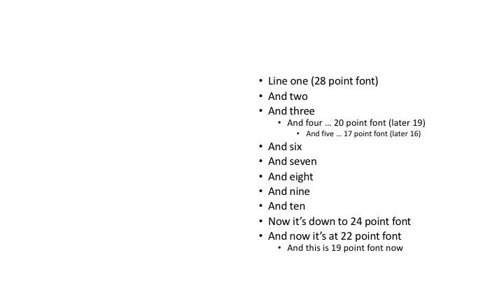
Bullets go a step further in auto-formatting: they change the font size dynamically as you fill the box in the vertical, and if you create sub-bullets by hitting “return/enter” and tabbing indents.
Surely, these defaults were designed to be helpful to users who are not in any way experienced in graphic design. Especially with the bulleted lists, these auto-formatting tools make it essentially impossible to push outside of the element’s frame (the box including the bullets), and to not go off the slide’s edge. That would be bad, wouldn’t it? Certainly you do not want words hanging off the edge.
However, this “helpful tool” generates slides that have made “death by PowerPoint” an unfortunately common phrase.
Auto-formatting bullet lists and titles make it very easy to make horrible slides.
The “wall of text” is commonly encountered in slides because the software does not help guide you** in creating an easy to read slide. It just guides you on balancing the various design elements – the positions of the boxes – in these default settings.
The key to designing slides that look like billboards comes in using only the text box to place words.
Why?
Because aside from the standard auto-formats, text boxes do not resize the font or stop you from running off the edge.
Text boxes most easily put you in command of where to place text.
This might seem counterintuitive to creating better slides, but it forces you to be very aware of both the possibilities and the limitations of the slide space.

You can place the text box wherever you wish around the slide – it does not start locked into place by a standard layout. With practice you can quickly use multiple text boxes to create lists of words in the vertical using whatever spacing between lines you would like, not auto-formatted. This means if you heed the below rule, and remain minimal in your word choice, you can create clean lists that do not need those pesky bullet points that encourage fast reading.
Here is the key to treating text like a graphic – after typing in your text, you can resize the font to whatever you would like.
My personal rule:
Start the text as large as possible then shrink it to fit on the slide.
If you have to shrink more than 25-50% you have too much text on the slide.
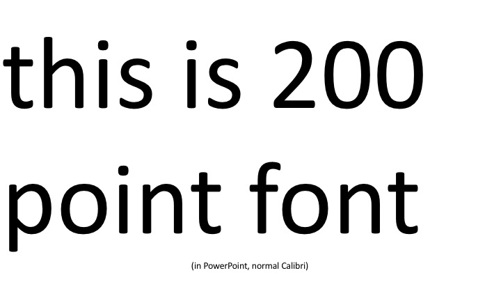
More specifically in PowerPoint: start at 200 point font. Use line blocking to fit the text as much as possible to the slide frame. If you have to shrink the font, don’t go below 100 point; ratchet it down by increments of 10-25.

In Keynote, use the same approach, but for whatever reason you can start with a much larger font size than 200 point, then ratchet it down in increments of 25-50 and do not go below 200 point.


(Captions of course, used sparingly, are annotations and should be relatively tiny.)
This is opposite from how the software is designed in default: both PowerPoint and Keynote have you start small.
Starting with a smaller font size conditions you to think you can always add more words, which leads to those “wall of text” slides.
But why do I say treat text like a graphic element?
When we place pictures (images) on slides, we more often make them as large as possible. We think of all the detail in the image, or we really like the sentiment it conveys, and we want that as big as possible. Granted, I have seen slides that have a fine-grained mosaic of many small pictures, but that I think happens less in presentations than text-heavy slides. I think.
Treating text like a graphic element puts it into the part of your design mind that says “make this as big as possible.”
To make text as big as possible means you will have to edit out some words. Maybe a lot of words. And what does a slide with these large font words give you?
A slide that looks like a billboard.
You generate slides with Audiences First Design: slides that grab attention, are very readable, and retain attention through the presentation overall. The audience quickly gets the point of the individual slide and turns their attention back to you.
Whenever you present text to an audience, their minds will try to read it. The more text there is, the more they’ll focus on reading and the less they will focus on you. This fractures attention and you may never get it back.
After all, if everything is on the slides, why are you bothering to talk through the presentation? Just give the audience a handout if you have nothing but walls of text. Walls of text are a text document shown through a projector, not a presentation.
There is a consequence of having slides with large font text: there is little room for graphics as well. That is entirely the point when designing slides that look like billboards. In an era when slides are computer files, you can easily add more slides to each contain single ideas. This is why you can, and should, use as many slides as you need for a given presentation.
Therefore in the end, put Audiences First.

*Unless you have altered the default settings. For me personally, I find it is better to think about how to design slides well than change all the defaults. But, if you are the sort that prefers to change defaults, by all means, set up for the best result you need in your process.
**I notice in the most recent PowerPoint there is an offer in the sidebar to create slides that look better. I have not, as of this writing, played around with that new feature yet. If you follow the above advice on treating text like a graphic however, you can create good slides on your own. With some practice.


Leave a comment